Mapping Twitter sentiment is a bitch
In this entry I hope to highlight some of the major issues that I encountered while working with maps on the Twitter sentiment analysis project.
This is part of a series of entries that will be taking a look behind the scenes of the Twitter sentiment analysis project.
Starting out
I originally plotted Twitter sentiment on a map of the UK using Polymaps, with the hope that patches of similar sentiment would occur in specific locations. Unfortunately this wasn't the case, and the first maps that I produced were basic and showed absolutely no patterns (aside from being an elaborate way to see where the countryside is).
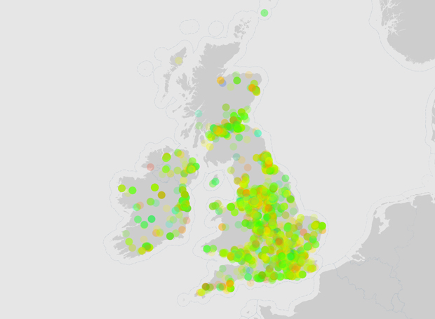
Original Twitter sentiment map
The way that the points were displayed was fraught with teething troubles; from how large they are, right down to how the colours are worked out. In the first maps, it was hard to tell a very happy emotion from a slightly happy one, and it also seemed to be that the whole of the UK was suspiciously happy. Another problem was that built up areas such as London were nearly impossible to distinguish under a horde of slightly-transparent-but-now-completely-solid-because-there-are-way-to-many points.
One approach was dedicated to experimenting with the dimensions and transparency of the points, which ended up with a decision being made that smaller and less transparent points are the best.
Point resizing on the Twitter sentiment map
Adding context
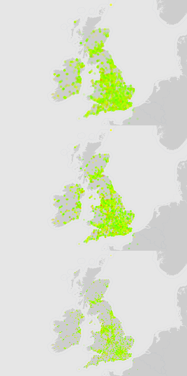
This was great, but it was just a crap load of coloured points that didn't have much of a context. The next step was to analyse data over a period of days to see whether the sentiment changed and, if so, whether it was random, or following a pattern. To try and visualise this, I took two maps and put them side by side for comparison.
Basic comparison of Twitter sentiment maps
At a high level, some differences were immediately obvious, like the number and location of red points (severely unhappy tweets). However, at a lower level the differences are hard to notice; like the subtle fluctuations in happiness (the majority of sentiment is between 4 and 8 on a scale from 1 to 9), or the change in quantity of tweets in a particular area.
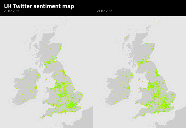
To tackle the subtle fluctuations in the sentiment, I changed the algorithm that determined the colour of each point so that it only calculated a colour if the sentiment was between 4 and 8. Any points that had a sentiment outside of that range were given a red colour (below 4), or a green colour (above 8). This single difference made the map come to life with much more diversity between the points that were all previously green. It wasn't a perfect solution, but it solved the problem for the time being.
Refining colours of the Twitter sentiment map
Comparing map differences
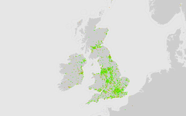
In an attempt to overcome another of these problems, I looked at layering maps on top of each other and visualising only the difference between them. This was achieved with basic layer styles in Adobe Photoshop and, although not perfect, it turned out to be an intriguing way to look at the data.
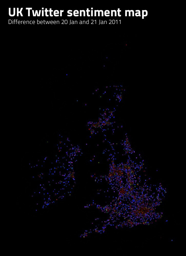
Comparing the difference between Twitter sentiment maps
The problem with this method was that the density of points in highly populated areas skewed the results. What happened was that the difference algorithm only output a colour if the colours on the same pixels in the two comparison maps were different. If the colours were the same, then the new colour on the new map would be black. Populated areas inherently had many more points than other areas, which also meant that they tended to turn into big green blobs, rather than lots of little points, each with a different colour. This meant that the populated areas had the impression that they had the same level of sentiment, bright green (very happy), even though this wasn't the case. This also meant that the difference algorithm assumed that the sentiment was the same and displayed populated areas as black (no difference).
I never pursued this issue any further, but I'm sure that there is more work that can be done to produce a better method of comparing the difference between two maps. One such method could be the use of heat-maps, instead of individual points.
Taking things further
For future map development I'd like to try out more powerful mapping systems, like TileMill. With the previous methods, I seemed to be spending most of my time constructing the core logic and functionality for displaying data on a map, rather than being able to quickly and easily change the way the data looked, on the fly. TileMill would change this because it uses stylesheets for managing how the data is displayed, and is updated in real-time.
I'd also be interested to plug in the sentiment analysis data into a previous experiment I performed last year with Cinder. This visual programming framework is both powerful and feature-rich, and allowed me to visualise a lot of data in a really nice way.