Finding patterns in Twitter sentiment
In this entry I hope to shed some light on the methods I used for finding patterns within Twitter sentiment data. Through the journey from maps to graphs, or the realisation that trends and granularity are massively important, I plan to document the lessons that I’ve learnt. I also look at the mystery surrounding the Twitter sentiment heartbeat that I uncovered during my research. It’s genuinely interesting!
This is part of a series of entries that will be taking a look behind the scenes of the Twitter sentiment analysis project.
Introduction
In this entry I hope to shed some light on the methods I used for finding patterns within Twitter sentiment data. Through the journey from maps to graphs, or the realisation that trends and granularity are massively important, I plan to document the lessons that I've learnt. I also look at the mystery surrounding the Twitter sentiment heartbeat that I uncovered during my research. It's genuinely interesting!
Moving from maps to graphs
As I've already mentioned, finding patterns in Twitter sentiment on a map has proven to be a little troublesome. It's because of this that I decided to scrap the idea of location-based sentiment analysis for the time being, instead focussing just on the sentiment over time.
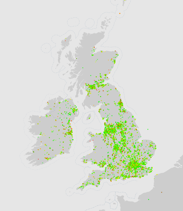
The best way that I could think of for visualising this would be to use graphs, and it was this decision that helped me to look at the data in a much clearer way. They weren't perfect, but they certainly worked better than the maps did.
Looking for a trend
When I was first looking at creating graphs, I started out by analysing the sentiment of individual Twitter users based on their 100 or so previous tweets. It was simple, but it allowed me to focus on the visualisation techniques, rather than spending ages collecting and converting data into a usable format.
However, there was a big problem with the way that I first started using graphs – there was absolutely no indication as to whether there was a pattern in the tweets. I had naively thought that there would be a perfect curve in the graph that showed that someone's tweets were sad in the morning, then got happier as the day progressed. Something like that.
I was wrong. So very wrong.
It turns out that most users seemingly tweet in a very erratic fashion, at least when run through a sentiment analysis algorithm. I needed a way to see through that, so I decided to add in a trend line that indicates how the sentiment progresses throughout the period of time that the graph covers.
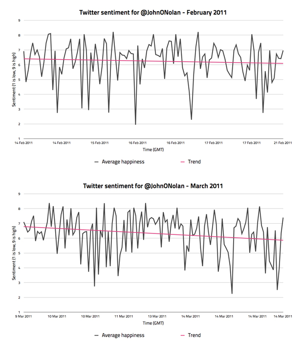
This line, albeit not perfect, opened my eyes to how useful these graphs could be. If the overall trend for sentiment over a period could be visualised, it allows you to see past the erratic tweet-by-tweet sentiment values. For example, in the graphs above you can see that my friend has gone from a slightly negative trend in February, to a profoundly negative trend in March.
It's worth pointing out at this point that I'm in no way saying that the method I use for sentiment analysis is perfect. In fact, I know it's not, and I know that it's definitely not representative of the kind of sentiment that a human being would perceive. What I mean by sentiment is the sum of the sentiment values from each English word within a tweet (based on the ANEW dataset), divided by the number of words within the tweet that had a sentiment value. In short, when I refer to sentiment I am referring to the average sentiment value for each tweet based on the ANEW dataset.
I'll be writing another blog post accurately detailing how I measure sentiment, so don't worry if you're still a little confused.
Graphing tweets sent within the UK
Measuring the sentiment of my friends was fun and all, but I'm much more interested in the bigger picture. I want to know what the overall sentiment is for the UK. Can it even be measured and relied upon? By running the Twitter scraper over a period of a few weeks, I hoped to find out.
The first challenge was that there is a helluva lot of tweets to analyse; way too many to display individually on a graph. To overcome this I decided to group all the tweets within each hour, and then average the sentiment of all those tweets to give me a sentiment value for that hour.
I ran this method of analysis on a few different days in February, but the one that jumped out to me as the most interesting was Valentine's day.
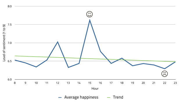
This is a day that you'd imagine would be filled with love and happiness, according to Clinton cards, yet as you can see it's a day with a big story to tell. Who'd have thought that one of the most romantic days of the year (for some) would have such a fluctuating and seemingly negative overall sentiment? Certainly not me.
What I found so interesting about the Valentine's day graph is that it shows a definite change in sentiment between 2 and 3pm (GMT). What happened at this time to cause the sentiment values to spike to such a happy level? Is it because people were nearly at the end of the working day and eager to see their loved ones? Or perhaps it was something else, like my analyse technique being screwy? I'd love to look into it further to find out.
Japanese earthquake
Aside from my general measuring of daily sentiment within the UK, I wanted to try and find some patterns related to tweets sent about particular global events. One such event turned out to be the earthquake in Japan, which quite rightly resulted in a huge outpouring of grief and support on Twitter. So how did this look like as a sentiment graph? Let me show you.
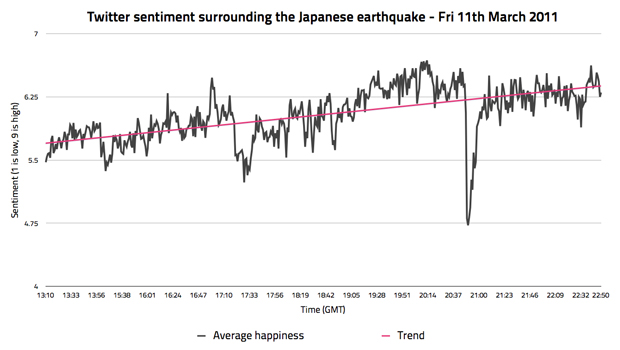
It's interesting, don't you think? Look past the fact that I'm measuring sentiment on a natural disaster, and look for the significant changes in sentiment. See the massive drops in sentiment, followed by a gradual increase? Also, see how the sentiment gradually increases to a much more positive state as the day progresses? Something abnormal is going on here, which is what you'd expect considering that this is a massive global event, full of fear, grief, relief (on hearing good news), and a whole variety of other emotions.
I never looked into this particular graph any further, but I'd love to lay it on top of a timeline of events to see if the changes in sentiment correlate to anything in particular. It would certainly make sense if that was the case.
Being aware of granularity
An overriding issue that I noticed throughout the early work with sentiment graphs was that hourly averages just didn't seem enough, especially when you're only comparing tweets across a single day. I needed something a little more accurate.
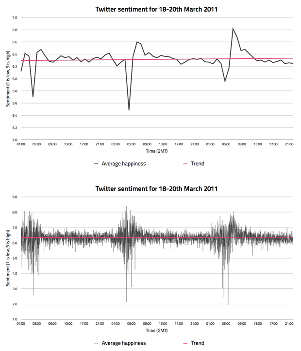
If you check out the graph above, you'll notice that the average sentiment per hour (the top graph) is actually very different to the average sentiment per minute (the bottom graph). This is obvious when you think about it, as less tweets being analysed means that larger fluctuations in the data are more likely to show up.
The only problem with this level of granularity is that it's an impossible amount of data to visualise when you're comparing any more than a couple of days. In short, there just aren't enough pixels on a screen to display it! Yes, you could create a graph that is larger than the size of the screen, but that's not ideal. Instead, for the larger graphs at least, I decided to go with hourly sentiment values.
Detecting the Twitter sentiment heartbeat
Quite recently, I stumbled across a pattern in the sentiment data that stopped me in my tracks. If my analysis was correct, I quite possibly uncovered a regular sentiment heartbeat on Twitter. I was shocked. This was awesome!
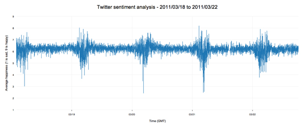
Do you see it? It's hard not to really. Every day there is a massive disruption in sentiment, at near regular intervals. I had no idea what was causing this, but I knew it was one of the most interesting developments in the project so far. I needed to look into it more.
At the back of my mind, and the minds of others as it turns out, was a niggling feeling that this pattern was directly related to the time of day. Not only that, but there was a feeling that the time of day caused a separate phenomenon on Twitter that was skewing my sentiment data. And what could possibly be affected by the time of day? The volume of tweets, of course!
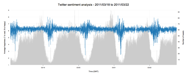
Like a sack of potatoes to the face, overlaying the volume of tweets on the graph suddenly made everything clearer. It was completely obvious that the volume of tweets directly affects the levels of average sentiment on Twitter. This was, and still is massive news for my research project.
Not only does this finding allow me to analyse my previous data in a new way; it also means that there could quite possibly be a regular sentimental pattern to Twitter. The reason for this is because, although the volume of tweets seems to affect the sentiment, it shouldn't affect the average sentiment if an equal amount of people are positive and negative. The fact that the graph fluctuates so wildly at regular times each day suggests two things: people who are tweeting in the early morning are possibly emotionally unstable, and also that there could be a distinct difference between the types of people that are tweeting through the day, and the people who tweet at night.
Whatever the reason, the fact that there is a heartbeat at all shows that there is reason to pursue this line of research further. This is exactly what I plan to do, perhaps by looking at other statistical areas of the sentiment data other than the average (like standard deviation, etc). I'm sure that I can find more to this data if I poke around long enough.
Summary
There are many more techniques and processes that I attempted in my journey to find patterns within the Twitter sentiment data, but I couldn't include them all in this entry. It's long enough as it is! My hope is that you found this at least interesting, even if you didn't learn anything particular.
What we can now safely say, is that the way you analyse and visualise data is massively important in the way that it's understood. It's obvious in hindsight, but I'm glad that I went into this project with a slightly naive way of looking at things. I learnt a lot, and it allowed me to really question the data and the results because I wasn't always 100% sure about the processes that I was using.
Definitely keep an eye on the Flickr set for the project if you want to keep up to date with the visualisations as they're produced.